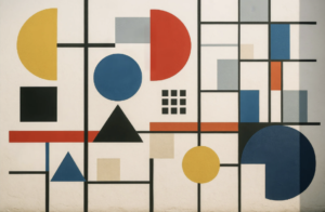
Bauhaus students learnt how the art and technique of using type and graphics should maximise the principles of economy, clarity and directness. The goal was to unite art and industrial design, fine and applied arts, creativity and manufacturing. The Bauhaus style of functional design, epitomised in Marcel Breuer’s “Club Chair”, echoed US-architect Louis Sullivan’s laws of form following function.
Lazlo Moholy-Nagy, who led the teaching of typography at the Bauhaus school, drew up a powerful manifesto for typography, stating that the aim of typographical layout is communication that should “appear in the shortest, simplest, most penetrating form.”
The relevancy of these words to how we should communicate with data is very clear. During the recent celebrations of how influential Bauhaus has been on modern computer-based art and design, British graphic designer and typographer Jonathan Barnbrook told the Observer newspaper: “In a world where most things are badly designed, everybody should learn the theories of Bauhaus before they are allowed to touch a computer.” Looking at some modern crimes against presenting data, I could not agree more.
The link between the Bauhaus school and successful data communication in organisations is not completely straightforward. There are some interesting breaks and kinks in how Bauhaus arrived to be a force in modern design thinking.
The Bauhaus school was shut down by the Nazis in 1933. This destructive act made the school a movement: its adherents needed to leave Germany urgently for their personal safety. This dispersed their ideas, skills and teaching globally. Most significantly, many of the movement’s founders settled in the USA where their concepts directly influenced everything from modern architecture to advertising to how data is presented.
The reinterpretation and amplification of the Bauhaus principles and work by many latter-day disciples helps explain why the movement has become so influential to data visualisation and many other fields today.
In my mind, one of the greatest indirect influencers of Bauhaus on modern data visualisation is the work of Bauhaus über-fan Jonathan Ive, the Apple chief designer. Ive has promulgated a classic form-follows-function design philosophy that has direct roots back to the Bauhaus movement, celebrating clean lines, geometric simplicity and minimalist elegance in how devices and GUIs are designed. Applying these same principles to how a data dashboard is laid out transforms the experience of using the dashboard.
Another lesson to be learnt is the extent to which the origins of the Bauhaus school contradicted its own popular image of order and calm. The school was run as almost a hippy commune, comprising many strange characters who often operated in chaotic ways and arrived at the school deeply affected and charged by the experience of the First World War. What is more, Bauhaus was set up with no strong commitment to industrial design or new technology, despite how much it influenced both fields.
Bauhaus was a vibrant melting pot of ground breaking, cross-discipline ideas and work. This is an excellent parallel with how data visualisation and analytics is being advanced today through diverse and passionate communities of data vizzers who want to share and celebrate new ways of communicating with data. One only needs to look at the large community projects such as Makeover Monday and the Storytelling with Data challenges to see the cross-discipline collaborations that echo how the Bauhaus school operated.
What can we take away from Bauhaus to improve our data visualisation? Communicating with vigorous simplicity and clarity is an obvious lesson. But for me, it’s also how the Bauhaus founders sought to break down barriers and had a strong belief that deep technical skills are vital for great art and communication.
Andy Cotgreave is technical evangelism director at Tableau